Scroll through an ecommerce category page and take a look at the brands in front of you.
Now cover the logos.
Could you tell which brand is which?
Probably not.
And that’s becoming a real problem.
I’ve been working in design for over 28 years and I’ve seen plenty of trends come and go. Some evolve into something more lasting. Others have a moment and then disappear. But lately, I’ve noticed something else happening. Brands aren’t just following trends. They’re starting to follow each other.
Through my work at ME BRAND, a boutique branding and packaging design studio, I see this first-hand. The muted colours. The serif fonts. The lowercase logos. The neutral backgrounds. The carefully curated product shots.
Individually, none of these things are necessarily bad. But when everyone starts using the same visual language, brands become harder to tell apart.
And if your customers can’t see the difference between you and your competitors, how are they supposed to choose you?
So Why Do So Many eCommerce Brands Look the Same?
Partly because there are now more tools than ever that make design accessible.
Templates allow brands to choose something, add their logo and get started quickly. AI can generate ideas, moodboards and designs in seconds. And whilst both can be brilliant tools, they can also make it very easy to end up with something that looks like everything else.
AI is only working from what already exists. Ask it for a premium skincare brand, a luxury candle brand or a modern wellness brand and chances are, it will start giving you variations of what it has already seen.
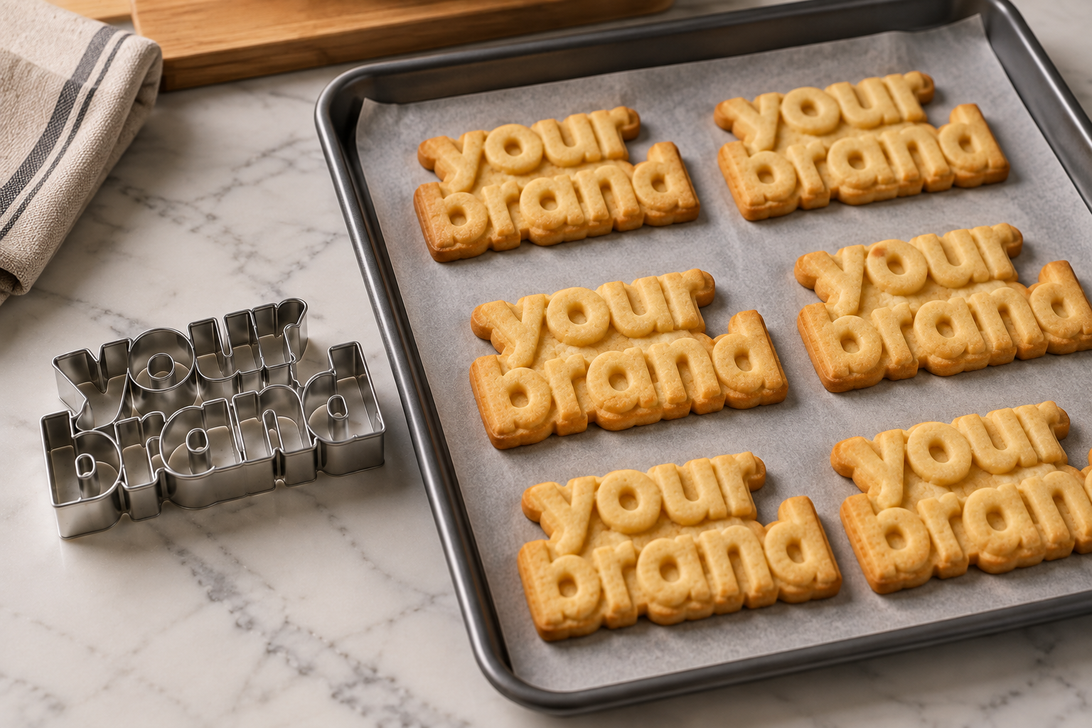
The result can be a lot of very polished, very professional-looking cookie-cutter design.
Then there is another problem.
A brand owner sees something a competitor is doing and thinks, I like that. So they start taking inspiration from it. Another competitor does the same. Before long, everyone in the category is looking at everyone else for inspiration.
And slowly, the whole category starts to blend together.
The problem is that everyone is so focused on fitting into the category that they forget to find a way to stand apart from it.
Looking the same can cost you
When your brand blends in, you’re making it harder to be remembered.
You may get someone to your website through an advert, social media or Amazon, but if there is nothing distinctive about the experience, what happens next time they see your product?
Do they remember you?
Or do they remember that product that looked a bit like yours?
Branding isn’t just about looking good. It should help people recognise you, remember you and build a connection with you over time.
The brands that are memorable and deliver the best experiences are often the ones that stand the test of time.
They don’t need to reinvent themselves every time a new trend appears. They’ve built something recognisable enough to evolve without losing who they are.
Standing out doesn't mean being weird or shouting the loudest
There’s a misconception that being distinctive means doing something completely different or deliberately out there.
It doesn’t.
You don’t need to use the brightest colour, the strangest logo or packaging that looks nothing like anything in your category. You just need to stop designing by copying the formula everyone else is using.
Start with what’s actually true about your brand. Ask yourself:
- What makes your product different? Don’t start with what looks good. Start with what makes your brand worth choosing.
- Who are you actually talking to? Your visual identity should connect with your customer, not just look good on a moodboard.
- What experience do you want people to have? Think beyond the logo. Every touchpoint contributes to how people see and remember your brand.
- What can you own that makes you recognisable? That could be a colour, a particular way of using typography, a distinctive shape, an illustration style, your tone of voice or something built into the customer experience itself.
The answer won’t necessarily be the same thing for every brand. And that’s the point.
You don’t need to be completely different from everyone else. You just need to be recognisably you.
Don't design in isolation
One of the simplest things you can do is put your brand next to your competitors.
Not your moodboard. Not the brands you admire. Your actual competitors.
Look at the packaging together. Look at the websites together. Look at the Amazon listings or social media feeds side by side.
What do you notice?
Do you blend straight in? Could your logo be removed and your product mistaken for someone else’s? Or is there something that makes people stop and recognise you?
You don’t have to be completely different from everyone else. Your customers still need to understand what you sell and where you sit in the market. But there should be something that makes your brand recognisably yours.
Being inspired by a trend is one thing. Building your brand around the same formula as everyone else is another.
And whilst templates and AI can help you move faster, they shouldn’t be the thing that decides what your brand looks like.
Otherwise, you risk creating a perfectly polished brand that looks great, but looks just like everyone else’s.
Author: Kitty Lai
Visual design expert, brand strategist,and the founder of ME BRAND,
a boutique branding and packaging design studio.